To gain more experience using motion as a design element, students created a futuristic weather report. The weather reports shows the high temperature, low temperature, and a symbol of the climate for four different cities. The video was organized by using the LATCH system: Location, Alphabet, Time, Category, and Hierarchy. We were asked to use three of the above categories from the LATCH system, having them transition into one another without any data leaving the screen. My weather reports shows location through a map, alphabet by the cities being in alphabetical order, and time by arranging the temperatures per city by day.
Monday, March 21, 2011
Weather Report
To gain more experience using motion as a design element, students created a futuristic weather report. The weather reports shows the high temperature, low temperature, and a symbol of the climate for four different cities. The video was organized by using the LATCH system: Location, Alphabet, Time, Category, and Hierarchy. We were asked to use three of the above categories from the LATCH system, having them transition into one another without any data leaving the screen. My weather reports shows location through a map, alphabet by the cities being in alphabetical order, and time by arranging the temperatures per city by day.
Playful
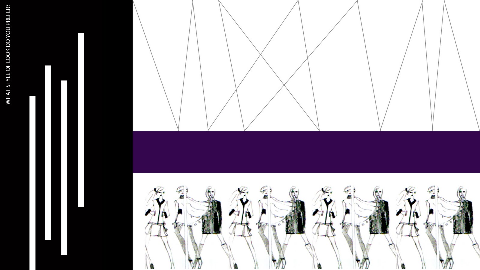
To begin Advanced Typography, we created two videos animating different words. The word in motion project taught students to think different about typography and realize that as designers, we must not only study how to arrange text within a static piece, but also learn to study text that is in motion.
Tension
To begin Advanced Typography, we created two videos animating different words. The word in motion project taught students to think different about typography and realize that as designers, we must not only study how to arrange text within a static piece, but also learn to study text that is in motion.
Blue Squares
For a beginning mini-project in Advanced Typography, we were asked to create a video that mimics the original in After Effects.
Sunday, March 20, 2011
Material Studies

This project required me to create a typeface out of a material with limited movement. By working with my material’s restrictions and discovering how my material, trimmer line, is different from others, the typeface becomes something only that medium can form. To create this typeface, Trim, I lit the trimmer line on fire to make it moldable and to fuse the letters together. The second part of this assignment was to photograph the typeface in an appropriate setting in relation to what the typeface is made from.
Critical Mass
Scales- Pop Art and Cut And Paste


This project, called Scales, was designed to teach students how to produce mass amounts of work under one theme and within one day. We created our own images by using a library of images provided by the professor. Each image was required to answer a certain prompt. This series of images had to be of the Cut and Paste or Pop Art style.
Scales- International Style


This project, called Scales, was designed to teach students how to produce mass amounts of work under one theme in one day. We created our own images by using a library of images provided by the professor. Each image was required to answer a prompt. This series was created with International style as the theme.
Scales- Constructivism


This project, called Scales, was designed to teach students how to produce mass amounts of work under one theme in one day. We created our own images by using a library of images provided by the professor. Each image was required to answer a specific prompt. This series of images had to styled around Constructivism.
Scales-Tactile


This project, called Scales, was designed to teach students how to produce mass amounts of work under one theme in one day. We created our own images by using a library of images provided by the professor. Each image was required to answer a specific prompt. This series of images had to contain something tactile that was photographed.
Scavenger Hunt

This project was created to teach students to consider formal elements of design (space, texture/pattern, line, value, color, pattern, shape/form) when taking and editing photographs. Each photograph above relates to the previous one. The elements the photographs share are as followed: 1/2- space, 2/3- color, 3/4- line, 4/5- value, 5/6- texture.
Saturday, March 19, 2011
Personal Geography- Cognitive Map

This is the third of a three part mapping project. Students were required to create three separate maps, each depicting the same trip. This project taught me how to use abstraction and utilize symbols and colors to communicate a message without text. The cognitive city is the product of the brain and its experiences: how the inhabitant structures his or her perceptions and links them to the physical network (Mark Treib). Part three of my mapping assignment was to map my decisions on the way to school from my home and show how they affected my following desicions.
Personal Geography- Perceptual Map

This is the second of a three part mapping project. Students were required to create three separate maps, each depicting the same trip. This project taught me how to use abstraction and utilize symbols and colors to communicate a message without text. The perpetual city is a negotiation between the artifact and the human being (Mark Treib). Part two of my mapping assignment required me to map my perceptions on the trip from my home to class.
Personal Geography- Artifact Map

This is the first of a three part mapping project. Students were required to create three separate maps, each depicting the same trip. This project taught me how to use abstraction and utilize symbols and colors to communicate a message without text. The artifact city is: the physical, indisputable, the network of streets and urban places and the buildings that surround and define them (Mark Treib). Part one of the mapping assignment entailed designing an artifact map from my home to class.
Symbol Methodology Animation
This is a short interactive animation project that shows the certain parts of the symbol methodology project- the matrix, the iterations, and the final symbol. The video was made in Flash and requires the viewer to click buttons in order for the video to progress. To start the video, click on the word "telecommunications". During the video, you will be asked to click on a symbol of your choice. Only one of these symbols will progress the video. At the end, there is also a replay button.
Symbol Methodology Project
The following images are from a Graphic Design I project titled "Symbol Methodology". The idea is to create three symbols for an institution by using the methodology. The institution I chose was telecommunications. The three categories I chose to describe telecommunications are: visual communication, text communication, and audio communication. We began the methodology by coming up with 100 words to describe our institution.


From the three categories- visual communication, text communication, and audio communication- we came up with three attributes from each. The attributes are- visual communication: smoke signals, photography, and video chat, text communication: letters, email, and texting, and audio communication: magnetic recordings, CB radio, and morse code. From this, we created one symbol for each attribute. For each category, one of the attributes symbols was photorealistic, one was hand-drawn, and one was abstracted.

With these original symbols, we then put them into "the matrix". The matrix allowed us to create 12 new symbols by "breeding" the originals together. Per category, we combined the hand-drawn+abstract, hand-drawn+photorealistic, photorealistic+abstract, and hand-drawn+photorealistic+abstract.

The next step involved picking one hybrid symbol per category and vectorizing it in Adobe Illustrator.

And finally, we chose one final symbol per category.

Ducky

Friday, March 18, 2011
Type Specimen Book
Design Culture Now Poster

This is a 24x36 poster announcing a design conference that was featuring four different designers. The main focus of this project was typographical hierarchy.
Prototype

For this project, students were asked to create a typeface utilizing a 9x9 grid. To create a greater challenge, we were not allowed to use portions of squares or create "staircases" by having three single squares in a diagonal row.
Subscribe to:
Comments (Atom)